Tumblr themes
I made some tumblr themes similar to the one I use. I coded these, so please don't remove any credit.
Opalescence theme
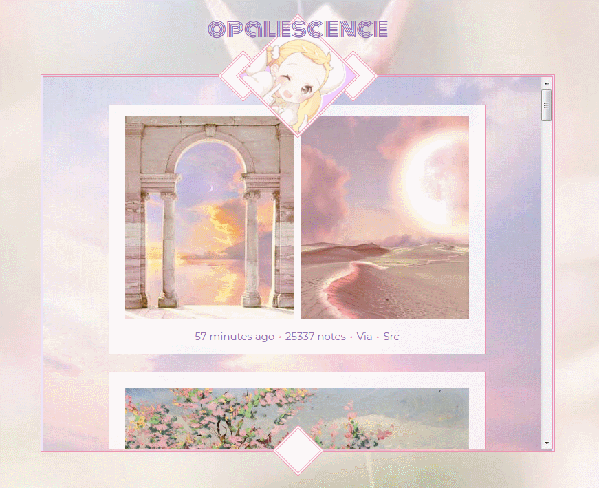
This is my first theme release. *pops party popper* A classick Admin container theme.
Since the icon at the top has to be rotated at an angle to be a diamond, there is an option to not rotate the icon and have it just be a square if you don't like that. You can make it a circle, too.
If you choose not to upload a background for the container or the posts, the default is a see-through white as seen in the 3rd preview. You can also make it a see-through black with a toggle like in the 2nd preview, or you can input your own rgb numbers in the html editor.
Icon in the 1st preview by a deleted artist. Icon in the 2nd preview by Sensaki Chihiro. Background in the 4th preview by Cocashy.
06.07.20 | Code
Stellar theme
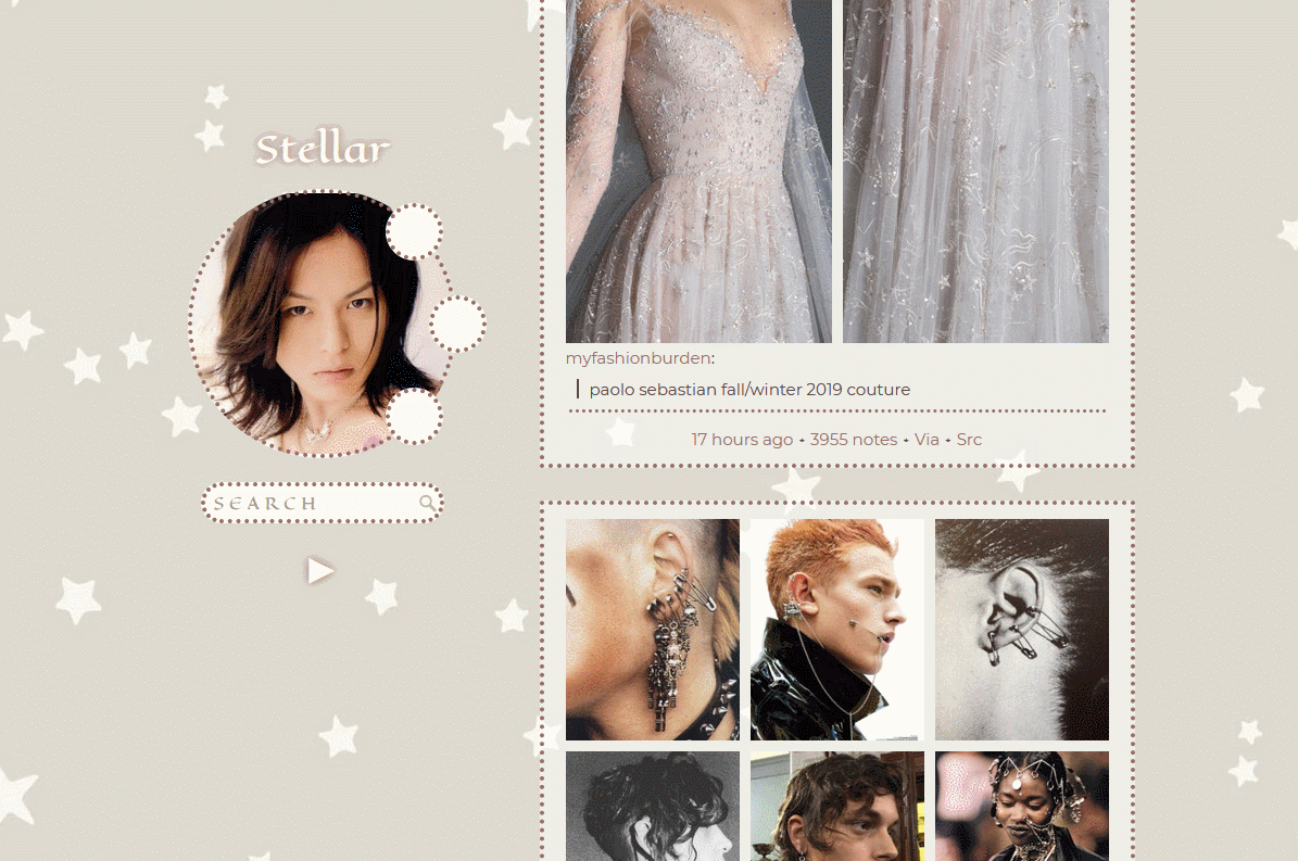
Woohoo! (Not the Sims kind) This is a theme with a circle sidebar icon and a search bar. :0) Woah woah! The links spin when you hover over them!
You can change the font size of your description and the colour / text that is in the search bar. Also…. rounded corners! There is also an option to have smaller dot borders. Oh, and because I wanna keep my double border trademark, I added an option for nice double borders too. The links won't look like they're rotating unless you give them a background picture though.
When you upload an icon, there will be "naked" spots at the tip top, bottom, and sides of the circle where the border is. You can see this in the first preview at the top of the dude's hair where it is white because it doesn't fill in the entire circle. This will be real obvious if you choose a picture that isn't a perfect square. I added a colour option called "iconcircle" so you can pick a colour that matches the edges of your icon and makes it look less ugly.
This one has almost the same options as the previous theme. Translucent white or black post backgrounds or upload your own background picture. The icon in the 2nd preview was drawn by Azu. on Pixiv.
07.17.20 | Code
Perception theme
This theme is an amalgamation of all of my themes. You can have a cool eyeball shaped sidebar, and your description is the iris!!!! Or keep a classick diamond or square shape. You can have eyeball shapes, regular default Admin-brand diamonds, or the cool teardrop shaped links that you see in the 3rd preview. You can change the description and title font sizes.
Anywhere you see "circle", that is referring to the little diamond / eye shaped links. Also, you still have the options to change the post backgrounds to be translucent black or an image of your choice. I just didn't include it in any previews ghdhgdfg.
To change the background you see on the left and right sides, they use the same image, and they are labeled as "sidebars". The actual background is the middle part where the posts are. "Admin why did you make two side columns instead of one center column??" Shhh.
07.20.20 | Code